000off_ZAHA HADID: THE TAXI CONVERSATION
Zaha Hadid was, as the world’s most visible architect, a form of calibration for me. If not for us all.
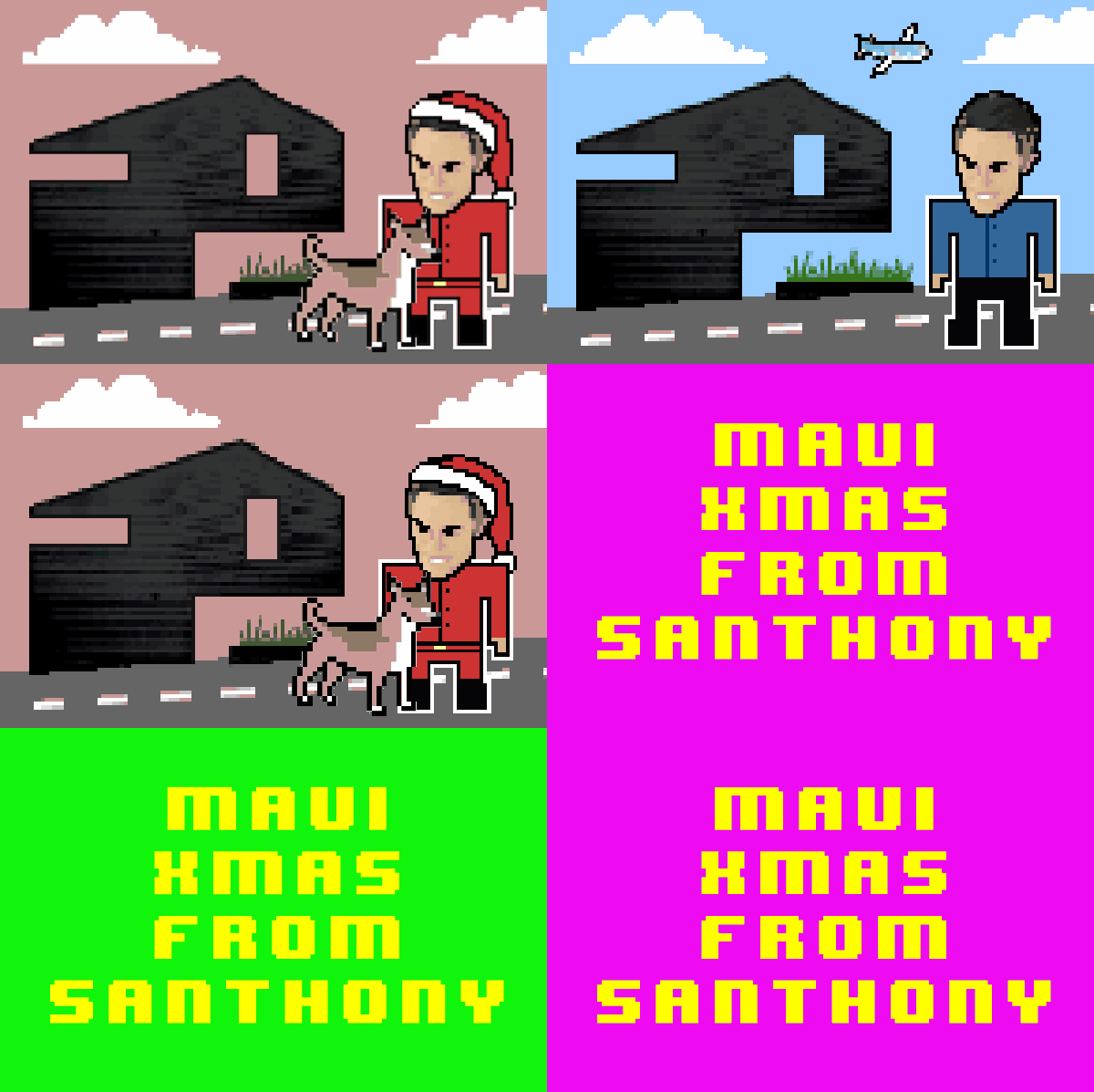
In the Game of Architecture, I manipulated her in video as a relevant ‘voice of authority’ albeit in a form that was, in resolution, more 8-bit than parametric. As a student, I had first encountered her in the Deconstructivism catalogue from the exhibition at MoMA in 1988. I had trouble reading the images: was it a plan, section, elevation or all of these at once? Was it even an architectural drawing or was it art? In my infantile introduction, she even had, like Zoro, a cool Z-name. That exhibition, but particularly in Zaha’s Peak drawings, was everything I never expected of architecture.
Her death is also unexpected. She is now probably laughing loudest at her innate ability to surprise once again. Zaha built at a scale and ambition that a young architect can only dream of. Zaha calibrated us all through her work asking: what kind of architect do you want to be?
When I read Rowan Moore’s article in the Observer how “future first minister of Wales, Rhodri Morgan, expressed the fear that her design would bring down a fatwa on the city, like that issued against Salman Rushdie, on the grounds that it resembled a heretical version of the Kaaba in Mecca” it calibrated my own practice’s experiences in dealing with political power in relationship to the architectural project: the Spotted Dog, in East London, had at a Development Committee review, a councillor quip that the project looked aggressive because of the pointed, that is gabled, roof form which itself was informed by the adjoining listed building. That was enough to send the planning officer barking…
blablablarchitecture blogs an article which first appeared in Monument Australia (2002) and then subsequently in ROAM (BDP 2003). To share a taxi ride with a Zaha was the metric for what was supposed to be an interview but trazcendatlly became a conversation: a cinematic trip of around 45 minutes with the city projected up against the windows.
This interview was orchestrated in a London taxi as a means of convenience for the moving media target that is Zaha Hadid. Given the haplessness of agenda synchronisation, the only possibility that presented itself, was to choose from a complex array of point-to-point ‘interview itineraries’: home-to-office, office-to-airport, airport-to-lecture theatre, theatre-to-restaurant, restaurant-to-club. This setting is highly appropriate giving the content at hand: automobility and architecture. Surprisingly, given the number of mobility projects her office is currently engaged upon, Zaha doesn’t drive. Zaha is chauffeured around London in her very own black cab that, according to legend, easily accommodates her “voluminous figure without crushing the undulating pleats in her Issey Miyake”. Hadid herself cites more pragmatic reasons for her choice of automobile: the taxi is like a van for carrying models and drawings. It is a machine for working in, a minicab for minicad. Other unannounced benefits include the use of lanes reserved for buses and taxis. The mobile space of the taxi, at once public and private, is a void that renders its mobilised occupants anonymous amongst the humdrum of city traffic and urban flows. Somewhat quixotically, Hadid’s other car is a Smart…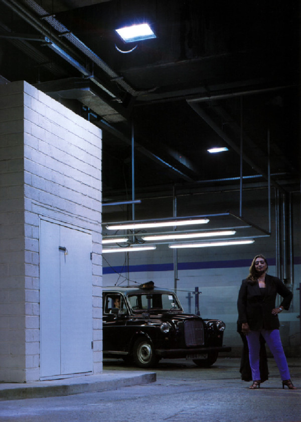 The Taxi Driver’s Guide to the City
Of the countless citizens whose daily routines have undoubtedly equipped them with an acquired spatial understanding of the city, the taxi driver stands apart. “The Knowledge” is a formal examination required by licensed black cab drivers and tests their ability to locate any street or public building within London. For example, in the map test ‘How to become a London Taxi Driver?’ one question asks, “where is the Croatian Embassy?” Such metro processing is no trivial feat given the inherent multiplicity of London’s street names: 23 King’s Roads and 7 Queen Streets. For someone whose automobile existence is solely one as passenger, it is remarkable that Hadid herself professes to know every short cut between home in Kensington and the office in Clerkenwell. These daily journeys, the city sectioned by the car, reveal how this metropole has metamorphosed in the last few years from ‘greasy spoon’ to Starbucks. A roadside education. The reconstitution of the taxi ride as urban pyscho-geography par excellence is not limited to the dynamics of location and pathfinding; no, the contemporary taxi ride is an event-space incorporating chat room, opinion poll, counsel chamber and meteorological office. The taxi ride as this interiorised public space is also seen disconnected from various urban settings in Jim Jarmusch’s Night on Earth. Suspended between fixed destinations, the film circulates around the brief, but poignant, encounters between a driver and his / her passenger over five simultaneous taxi rides: Los Angeles, Rome, Helsinki, Paris and New York
The taxi as publicity machine
The taxi is partly a public space and its surfaces are thus festooned with advertising and publicity. Metrocab Advertising declares that by “travelling in close proximity to the advert, in a relaxed atmosphere of modern comfort and privacy, the passenger absorbs your message.” That Hadid owns the one automobile that doubles as a mobile billboard is consistent with her media presence. The work of Zaha Hadid, however, is its own advert and through it she has become the world’s most visible architect. Her obsessive preoccupation with the formal qualities of architecture renders an aesthetic vocabulary that is at once recognisable and instantly legible. This is an indictment of the globalisation of architecture as brand building where the super-client is free to pick ‘n’mix from the architectural supermarket. Few architects have controlled, developed, formed and articulated architecture through its visual media (painting, drawing, modelling, building) like Hadid has done. The product is unquestionable identity and authorship. The anonymity of the architectural competition is laughable when confronted by an oeuvre whose signature lies not as a logo-in-the-corner but in the iconic composition of the work itself. Such formal pursuits have also been Hadid’s greatest criticism. Her first built project, the Vitra Fire Station in Weil am Rhein, Germany, engaged with the movement through purely sculptural manipulation. Fragments and shards appear yet these are the by-products or after-effects of an aversion towards orthogonal geometry. The building thus looks like a photograph of an explosion rather than the explosion itself: any motion is merely implied rather than actual.
The value of this work is that it shows architecture in stasis. Architecture’s appreciation of mobility in the modernist period was in its aesthetic expression. Buildings aspired to look like boats and cars. Movement in buildings was a caricature of the ‘dynamic’, undertaken as the formal pursuit of composition. If architecture continues to imagined as ‘still life’ then it will always remain ultimately pedestrian.
Automobility and architecture
Having established the scene, we now direct discussions towards Hadid’s own brand of carchitecture. As a perpetual passenger Hadid’s own architectural vision is characterised by a sense of motion and her work is permeated with intersecting paths, junctions, routes and vectors. Highway engineering and bridge building have been deployed as internal mechanisms to organise space; “the interesting thing about motorways and intersections is how they bundle and separate, come together again and separate”. This interest is prominent in the recent winning entry for the BMW competition for an Administrative Building in Leipzig. Here the Central Building is the active nerve-centre or brain of the factory complex. All threads of the building’s activities converge, intersect and diverge from this focal point and the organisational strategy applies to the routine and trajectories of the employees as well as for the cycle and procedures of the production line. It appears as if the entire expanse of this side of the factory is oriented and animated by a force field emanating from the Central Building. All movement converging on the site is funnelled through this compression chamber squeezed in-between the three main segments of production: Body in White, Paint Shop and Assembly.
Popular Mechanics
The primary organisational strategy is formalised as a scissor-section connecting ground floor and first floor as a continuous field. Two sequences of terraced plates – like giant staircases – step up from north to south and vice versa. One commences close to the public lobby passing by and overlooking the forum to reach the first floor in the middle of the building. The other cascade starts with the cafeteria at the south end moving up to meet the first before proceeding all the way up to the space projecting over the entry. The two cascading sequences capture a long connective void between them. At the bottom of this void is the auditing foyer – the centre of attention for the production plant. Overhead, half-finished cars move along a production line. The cascading floor plates are large enough to allow for reconfigurable occupation patterns, promoting greater visual dialogue than permissible on a single floor plate.
Car production plants have a history of establishing new levels of employment conditions. Henry Ford, who introduced the production line technique of repetitive specialist tasks, compensated for the tedium by offering minimum wages and employee housing. With the threat of union action ever looming, the mixing of blue and white collar workers is crucial for the prolonged success of BMW. The architectural means for political accountability is once again spatial transparency and so a high level of visibility is provided between managerial and production departments. The mixing of functions further avoids the traditional segregation into status groups that is no longer conducive in the modern workplace.
Infrascapes
The scalar range of architecture is shifting. Until recently architecture was preoccupied with scales of space that were more often than not building fixated. One could conveniently describe this as operating between scale 1:20 and 1:200. Today, infrastructure and landscape, Infrascapes’, have increasingly become the new (realisable) design scales for architecture. Buildings are getting bigger! The Carpark and Terminus Hoenheim-Nord, commissioned by the city of Strasbourg, is such a project with its concept of overlapping fields and lines that knit together to form a constantly shifting whole. The fields are the patterns of movement engendered by cars, trams, bicycles and pedestrians. Each has a trajectory and a trace as well as a static fixture and the transition between modal types is seemingly materialised in the station, landscaping and its context. The Carpark is divided into two parts that cater for 700 vehicles. The notion of the cars as being ephemeral and constantly changing elements on site is manifest as a ‘magnetic field’ of white lines on the black tarmac. Each parking space is orientated North / South at one end of the site. Each subsequent row is then rotated one degree causing the entire Carpark composition to twist. Each parking space is identified with a vertical light post and these collectively establish an artificial datum against the varying topography. In contrast with the ground lines, a zone of dark concrete, an imaginary shadow – reminiscent of the Bolles Wilson’s Ninja shadow on the façade of their Suzuki house – slices like a sinister presence through the Carpark.
Urban taxidermy
Urban taxidermy is the architecture of organising, arranging and programming the city in order to give it the appearance of vitality. Are the presence of cabs and taxis enough to suggest a bustling metropolis? Hadid recognises the strained relationship between the automobile and the city through her daily commutes. London is after all a city so heavily congested by poor transport planning that the average speed of traffic at the beginning of the twentieth century was no greater than that at the beginning of the twenty first. If the city of speed is the city of success, as Le Corbusier proclaimed, then London is a resounding failure. Yet our experience of any city, and hence our response to architecture, remains one which is almost exclusively conducted through the space of the automobile. No longer just a means of getting from A to B, the journey is a place to be. The automobile has been an integral part of metropolitan life for so long that it is part of the urban fabric. That the taxi journey has overtaken that of the car is down to its urban engagement: a mobile public-private space, a city icon (the black cabs of London, the yellow cabs of NYC, the white taxis of Sydney, the Ambassadors of Bombay) and at times an urban cinema with its show of speed, event, movement and accompanying driver-narration.
Anthony Hoete (ROAM, BDP, 2003)
 The Taxi Driver’s Guide to the City
Of the countless citizens whose daily routines have undoubtedly equipped them with an acquired spatial understanding of the city, the taxi driver stands apart. “The Knowledge” is a formal examination required by licensed black cab drivers and tests their ability to locate any street or public building within London. For example, in the map test ‘How to become a London Taxi Driver?’ one question asks, “where is the Croatian Embassy?” Such metro processing is no trivial feat given the inherent multiplicity of London’s street names: 23 King’s Roads and 7 Queen Streets. For someone whose automobile existence is solely one as passenger, it is remarkable that Hadid herself professes to know every short cut between home in Kensington and the office in Clerkenwell. These daily journeys, the city sectioned by the car, reveal how this metropole has metamorphosed in the last few years from ‘greasy spoon’ to Starbucks. A roadside education. The reconstitution of the taxi ride as urban pyscho-geography par excellence is not limited to the dynamics of location and pathfinding; no, the contemporary taxi ride is an event-space incorporating chat room, opinion poll, counsel chamber and meteorological office. The taxi ride as this interiorised public space is also seen disconnected from various urban settings in Jim Jarmusch’s Night on Earth. Suspended between fixed destinations, the film circulates around the brief, but poignant, encounters between a driver and his / her passenger over five simultaneous taxi rides: Los Angeles, Rome, Helsinki, Paris and New York
The taxi as publicity machine
The taxi is partly a public space and its surfaces are thus festooned with advertising and publicity. Metrocab Advertising declares that by “travelling in close proximity to the advert, in a relaxed atmosphere of modern comfort and privacy, the passenger absorbs your message.” That Hadid owns the one automobile that doubles as a mobile billboard is consistent with her media presence. The work of Zaha Hadid, however, is its own advert and through it she has become the world’s most visible architect. Her obsessive preoccupation with the formal qualities of architecture renders an aesthetic vocabulary that is at once recognisable and instantly legible. This is an indictment of the globalisation of architecture as brand building where the super-client is free to pick ‘n’mix from the architectural supermarket. Few architects have controlled, developed, formed and articulated architecture through its visual media (painting, drawing, modelling, building) like Hadid has done. The product is unquestionable identity and authorship. The anonymity of the architectural competition is laughable when confronted by an oeuvre whose signature lies not as a logo-in-the-corner but in the iconic composition of the work itself. Such formal pursuits have also been Hadid’s greatest criticism. Her first built project, the Vitra Fire Station in Weil am Rhein, Germany, engaged with the movement through purely sculptural manipulation. Fragments and shards appear yet these are the by-products or after-effects of an aversion towards orthogonal geometry. The building thus looks like a photograph of an explosion rather than the explosion itself: any motion is merely implied rather than actual.
The value of this work is that it shows architecture in stasis. Architecture’s appreciation of mobility in the modernist period was in its aesthetic expression. Buildings aspired to look like boats and cars. Movement in buildings was a caricature of the ‘dynamic’, undertaken as the formal pursuit of composition. If architecture continues to imagined as ‘still life’ then it will always remain ultimately pedestrian.
Automobility and architecture
Having established the scene, we now direct discussions towards Hadid’s own brand of carchitecture. As a perpetual passenger Hadid’s own architectural vision is characterised by a sense of motion and her work is permeated with intersecting paths, junctions, routes and vectors. Highway engineering and bridge building have been deployed as internal mechanisms to organise space; “the interesting thing about motorways and intersections is how they bundle and separate, come together again and separate”. This interest is prominent in the recent winning entry for the BMW competition for an Administrative Building in Leipzig. Here the Central Building is the active nerve-centre or brain of the factory complex. All threads of the building’s activities converge, intersect and diverge from this focal point and the organisational strategy applies to the routine and trajectories of the employees as well as for the cycle and procedures of the production line. It appears as if the entire expanse of this side of the factory is oriented and animated by a force field emanating from the Central Building. All movement converging on the site is funnelled through this compression chamber squeezed in-between the three main segments of production: Body in White, Paint Shop and Assembly.
Popular Mechanics
The primary organisational strategy is formalised as a scissor-section connecting ground floor and first floor as a continuous field. Two sequences of terraced plates – like giant staircases – step up from north to south and vice versa. One commences close to the public lobby passing by and overlooking the forum to reach the first floor in the middle of the building. The other cascade starts with the cafeteria at the south end moving up to meet the first before proceeding all the way up to the space projecting over the entry. The two cascading sequences capture a long connective void between them. At the bottom of this void is the auditing foyer – the centre of attention for the production plant. Overhead, half-finished cars move along a production line. The cascading floor plates are large enough to allow for reconfigurable occupation patterns, promoting greater visual dialogue than permissible on a single floor plate.
Car production plants have a history of establishing new levels of employment conditions. Henry Ford, who introduced the production line technique of repetitive specialist tasks, compensated for the tedium by offering minimum wages and employee housing. With the threat of union action ever looming, the mixing of blue and white collar workers is crucial for the prolonged success of BMW. The architectural means for political accountability is once again spatial transparency and so a high level of visibility is provided between managerial and production departments. The mixing of functions further avoids the traditional segregation into status groups that is no longer conducive in the modern workplace.
Infrascapes
The scalar range of architecture is shifting. Until recently architecture was preoccupied with scales of space that were more often than not building fixated. One could conveniently describe this as operating between scale 1:20 and 1:200. Today, infrastructure and landscape, Infrascapes’, have increasingly become the new (realisable) design scales for architecture. Buildings are getting bigger! The Carpark and Terminus Hoenheim-Nord, commissioned by the city of Strasbourg, is such a project with its concept of overlapping fields and lines that knit together to form a constantly shifting whole. The fields are the patterns of movement engendered by cars, trams, bicycles and pedestrians. Each has a trajectory and a trace as well as a static fixture and the transition between modal types is seemingly materialised in the station, landscaping and its context. The Carpark is divided into two parts that cater for 700 vehicles. The notion of the cars as being ephemeral and constantly changing elements on site is manifest as a ‘magnetic field’ of white lines on the black tarmac. Each parking space is orientated North / South at one end of the site. Each subsequent row is then rotated one degree causing the entire Carpark composition to twist. Each parking space is identified with a vertical light post and these collectively establish an artificial datum against the varying topography. In contrast with the ground lines, a zone of dark concrete, an imaginary shadow – reminiscent of the Bolles Wilson’s Ninja shadow on the façade of their Suzuki house – slices like a sinister presence through the Carpark.
Urban taxidermy
Urban taxidermy is the architecture of organising, arranging and programming the city in order to give it the appearance of vitality. Are the presence of cabs and taxis enough to suggest a bustling metropolis? Hadid recognises the strained relationship between the automobile and the city through her daily commutes. London is after all a city so heavily congested by poor transport planning that the average speed of traffic at the beginning of the twentieth century was no greater than that at the beginning of the twenty first. If the city of speed is the city of success, as Le Corbusier proclaimed, then London is a resounding failure. Yet our experience of any city, and hence our response to architecture, remains one which is almost exclusively conducted through the space of the automobile. No longer just a means of getting from A to B, the journey is a place to be. The automobile has been an integral part of metropolitan life for so long that it is part of the urban fabric. That the taxi journey has overtaken that of the car is down to its urban engagement: a mobile public-private space, a city icon (the black cabs of London, the yellow cabs of NYC, the white taxis of Sydney, the Ambassadors of Bombay) and at times an urban cinema with its show of speed, event, movement and accompanying driver-narration.
Anthony Hoete (ROAM, BDP, 2003)
000off_Free Lunch vs Free Plan
Free Lunch: Continuing Professional Development (CPD) seminars are embedded within architectural practice as a ‘vital’ means (if you don’t, your RIBA membership is suspended…) to sustaining a professional educational ‘top-up’. Remaining relevant. CPD seminars are pitched to the architect-as-specifier by manufacturers who use the lunch hour to inform and ultimately sell their product in return for offering their captive audience CPD points. Thus ongoing RIBA membership. But more importantly sales via specification. CPD points are not, yet, redeemable in the local supermarket but are, significantly, manifest also with an accompanying free lunch. In this way CPD presentations at lunch times are a WHAT_tv dinner: eat and be entertained. We have held ‘sushi CPDs’ for some years now: enjoy here.
 Free Plan: the plan libré refers, and let’s use populist Wiki to save the debate, to the “ability to have a floor plan with non-load bearing walls and floors by creating a structural system that holds the weight of the building by ways of an interior skeleton of load bearing columns. The building system carries only its columns, or skeleton, and each corresponding ceiling. Free plan allows for the ability to create buildings without being limited by the placement of walls for structural support, and enables an architect to have the freedom to design the outside and inside façade without compromise.”
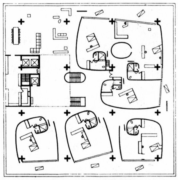 Result: Le Corbusier might have said “a free lunch is not as good as a free plan”. The intern/national office is still playing this thought out but is currently toying between an hour of a free£6 sushi vs losing 60 minutes of freedom .
 Free Plan: the plan libré refers, and let’s use populist Wiki to save the debate, to the “ability to have a floor plan with non-load bearing walls and floors by creating a structural system that holds the weight of the building by ways of an interior skeleton of load bearing columns. The building system carries only its columns, or skeleton, and each corresponding ceiling. Free plan allows for the ability to create buildings without being limited by the placement of walls for structural support, and enables an architect to have the freedom to design the outside and inside façade without compromise.”
 Result: Le Corbusier might have said “a free lunch is not as good as a free plan”. The intern/national office is still playing this thought out but is currently toying between an hour of a free£6 sushi vs losing 60 minutes of freedom .
000off_DEPRESTON_A QUALIFIED PLACE
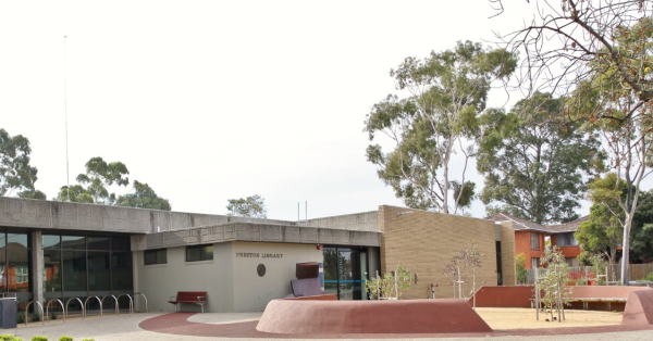
According to Pitchfork quoting TripAdvisor, there are precisely five “Things to Do” in the Melbourne suburb of Preston—and coming in at number two on that list of attractions is…the local library. “Depreston” is the name of a song by Courtney Barnett who’s humdrum setting finds herself considering a move away from the town’s quaint coffee shops to a place further out, where green space is plentiful. But whereas previous generations found solace in the predictability of tree-lined streets and boxy houses, Barnett can’t help but feel depressed while eyeing the innards of a deceased estate, the ghosts of the past tugging at her in the form of left-behind war photos, sugar cans, and, most pointedly, a handrail in the shower. The house may have been someone’s dream, but it ain’t hers.


000off_WAR X WALL X WATER
Thesis project by 吳卓昊 (Victor, Cho-Hao Wu) formerly of WHAT_architecture which looks to re-construct the daily life of Middle Eastern refugees.

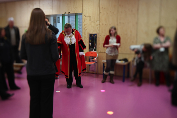
179prs_GAME OF KNIGHT MAYORS
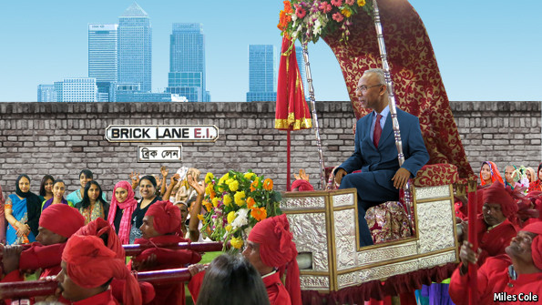 The Mayoralty election in Tower Hamlets…
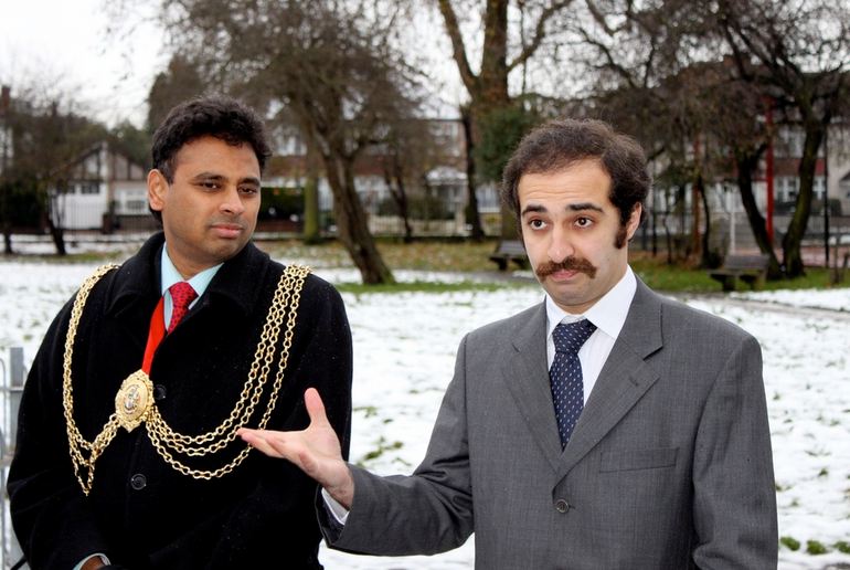
096agn_Mayor of Lambeth Niraj Patil inaugurates Agnes Riley Park with Reza Parizi of WHAT_architecture… in winter.
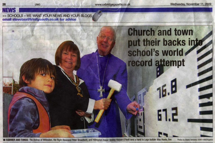
069hil_Mayor of Hillingdon Shirley Harper-O’Neill meets Maui Hoete of WHAT_architecture.
069hil_Mayor of Hillingdon David Yarrow meets Olatz de Solaeche of WHAT_architecture.
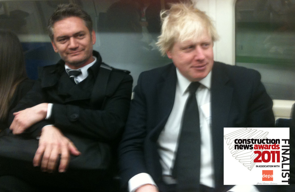
069hil_Mayor of London Boris Johnson meets Anthony Hoete of WHAT_architecture.
137aus_Lord Mayor of Perth Lisa Scaffidi meets Anthony Hoete of WHAT_architecture. [INSERT image]
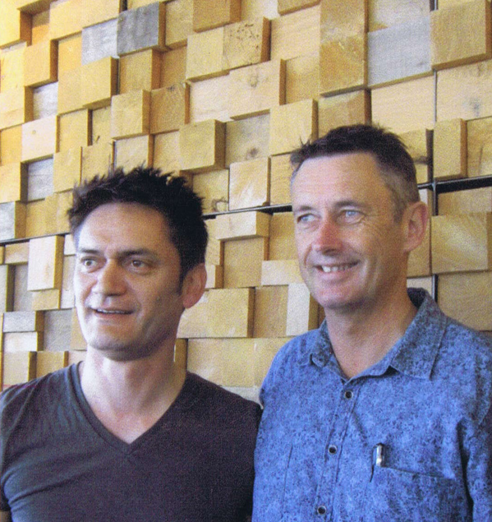
000mot_Mayor of Tauranga Stuart Crosby hangs out with Ah!
