000mot_Someone built a house on the runway!
Building as a political act has been, historically, a legitimate means of architectural expression. blablablarchitecture recognises ‘talking through building’ as a form of media communication.
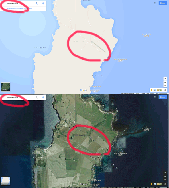
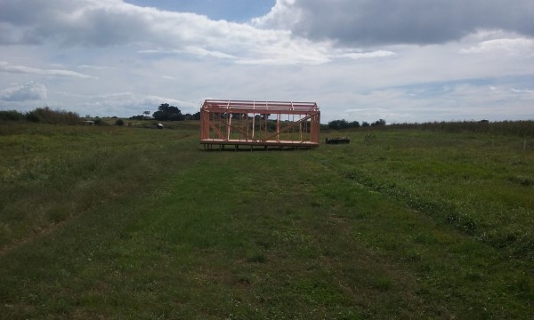
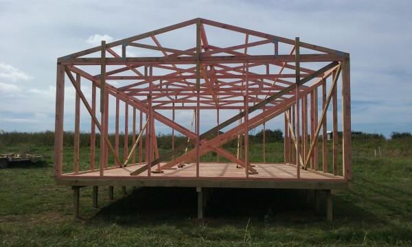
Someone has built a structure, presumably a house, on the komiti minuted, CAA NZ guided, Google map recognised airstrip on Motiti Island.
Granted this does not have the grandeur resonance say against the proposed planning of a third runway for Heathrow, but this simple timber frame structure is nonetheless a highly provocative protest placard. The structure, presumably a house given the skeletal timber frame seems compliant with NZS3604, has rather been deliberately been placed on the runway on Motiti Island. Yet by building this stealth structure over the course of a public holiday (Easter), planning barristers in NZ comment that they are ‘gob smacked’. The runway is now out of use. In doing so, the umbilical chord of the flight path is severed and thus some islanders are now stranded on the mainland, awaiting a clear landing path post-injunction.



048per_Villameter: Home of the Year 2016!
A house is an object, typically a residential building. The idea of the house as an object of desire has arisen through visual qualities relating to shelter, form, scale and materiality.
A home is ‘for living in’ and refers to both a building space and to a locational place. As a space a home is, first and foremost, social; as a place it is our identity. These non-visual qualities relating to use and occupancy mean the home creates, after family, our founding sense of place.
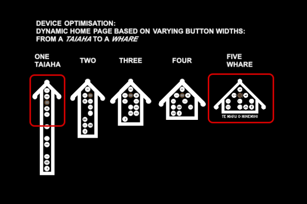
The Villameter as a home lays bear the frugal modernity of its occupants. This is not the house as showroom but the house decluttered…
The Villameter lost to it’s polar opposite: the Iron Maiden is (partially) made from recycled corrugated iron and located in a rural setting.

000off_Free Lunch vs Free Plan
Free Lunch: Continuing Professional Development (CPD) seminars are embedded within architectural practice as a ‘vital’ means (if you don’t, your RIBA membership is suspended…) to sustaining a professional educational ‘top-up’. Remaining relevant. CPD seminars are pitched to the architect-as-specifier by manufacturers who use the lunch hour to inform and ultimately sell their product in return for offering their captive audience CPD points. Thus ongoing RIBA membership. But more importantly sales via specification. CPD points are not, yet, redeemable in the local supermarket but are, significantly, manifest also with an accompanying free lunch. In this way CPD presentations at lunch times are a WHAT_tv dinner: eat and be entertained. We have held ‘sushi CPDs’ for some years now: enjoy here.
 Free Plan: the plan libré refers, and let’s use populist Wiki to save the debate, to the “ability to have a floor plan with non-load bearing walls and floors by creating a structural system that holds the weight of the building by ways of an interior skeleton of load bearing columns. The building system carries only its columns, or skeleton, and each corresponding ceiling. Free plan allows for the ability to create buildings without being limited by the placement of walls for structural support, and enables an architect to have the freedom to design the outside and inside façade without compromise.”
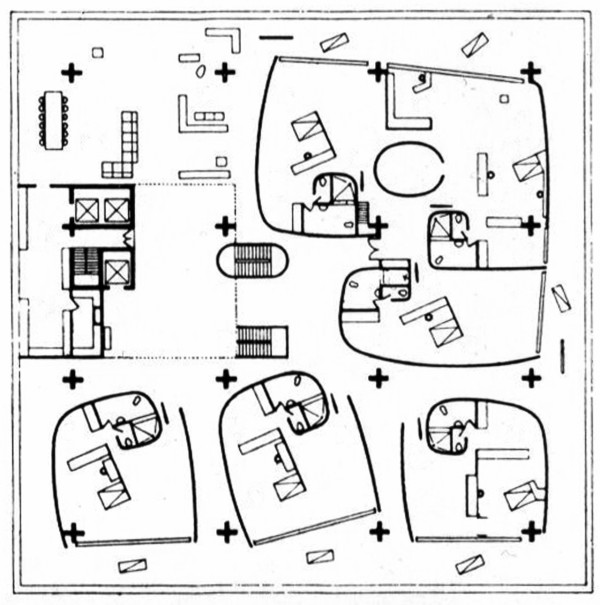 Result: Le Corbusier might have said “a free lunch is not as good as a free plan”. The intern/national office is still playing this thought out but is currently toying between an hour of a free£6 sushi vs losing 60 minutes of freedom .
 Free Plan: the plan libré refers, and let’s use populist Wiki to save the debate, to the “ability to have a floor plan with non-load bearing walls and floors by creating a structural system that holds the weight of the building by ways of an interior skeleton of load bearing columns. The building system carries only its columns, or skeleton, and each corresponding ceiling. Free plan allows for the ability to create buildings without being limited by the placement of walls for structural support, and enables an architect to have the freedom to design the outside and inside façade without compromise.”
 Result: Le Corbusier might have said “a free lunch is not as good as a free plan”. The intern/national office is still playing this thought out but is currently toying between an hour of a free£6 sushi vs losing 60 minutes of freedom .
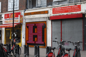
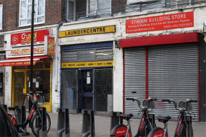
270lau_HOTELAUNDRETTE: AN ARCHITECTURAL LOBOTOMY
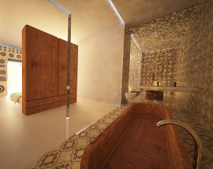
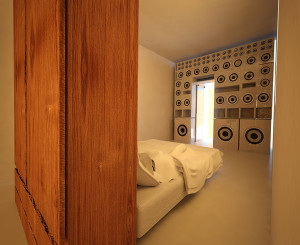
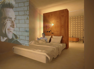
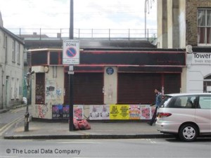
In Delirious New York, Rem Koolhaas refers to the architectural lobotomy where the contemporary city has disengaged form from function. In this sense, a lock-up in East London is merely a container whose external expression has little relationship to the undetermined interior activity within. The façade presented not as a face but as a mask. In engaging with the urban fabric why bother with the surface treatment of the exterior at all? Architects have been guilty of exterior decoration so why not just leave the streetscape as-is? This provides for a surprise upon entry, brokers the unexpected, of not knowing what’s behind… I privilege here not ‘interior architecture’ but more importantly ‘architecture as interior’. Satan’s Whiskers in Bethnal Green is one such flip between inside and out. Hotelaundrette is proposed here as another: enter here.
Below this difference between inside and outside is represented in the architectural image: golden interior vs grainy exterior.
