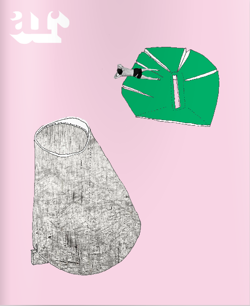
179prs_WHAT_architecture FC? The Gamification of Architecture!
SuperViber PRS 6 Preview with Dr Hook: The Practice-Research Symposium (PRS6) for WHAT_architecture is a game changer because the notion of WHAT_game we are playing has emerged:
WHAT_architecture FC: The Gamification of Architecture.
RULE 1: (FIELD)
Don’t just sit there and watch, be active. Even the spectator is a player. Invent a game, create opportunities, find a job. If you don’t play, you cannot win. Even if you lose you can still win. Or cash in. Evidence: 127sho: Acquired site. Generated 128art. 012hil: Found site / create the use. VAT_architecture. 000off: Find a job. Mecanoo (NL), Sauerbruch Hutton (DE), Andrea Bruno (I).
RULE 2: (PLAYER)
Once you have started to play, change positions. With each new position comes another viewpoint. Multiple viewpoints make you a better player. Architecture can be a vast Role Playing Game. EVIDENCE: 127sho_Architect, developer, gallerist, archeologist, conservation architect (x), publican, club promoter, restauranteur. 000mot, 012hil, 036akk_builder, 048per, 069hil_client as architect, 069hil_user as architect
RULE 3: (DURATION)
Think quickly and lucidly. No time can be an advantage: commercially, conceptually. Reconfigure the team to suit both the project and the team. Iterate ideas to crystallise ideas. Don’t dwell on a loss. It will cost money. Use whatever means necessary. EVIDENCE: 127sho_4 ideas (old-new build heritage crown, new build only demolition, old build only refurbishment, old-new build side tower, old-new build over-the-top; 226pea_the 3 day project)
RULE 4: (COMMUNICATIONS)
Develop a hierarchy of communications: i.e. don’t email the Fire Brigade when your house is on fire. Talk unlocks design intelligence. Create brainstorming games. Write more, you will draw better. Talk Buildings. Architecture is a form of play illuminated by mass media. No whinging: don’t be a bad loser. EVIDENCE: 127sho_48 posts @ 4,900 words, 128art_39 posts @ 2888words, 000off_blablablarchitecture: 673 posts @ 134,600 words, 7,269 LIKES. Pinterest 056mod. 000off_Lead Forensics 1,651 visitors October 2014
OBJECTIVES:
Maximise (or is that optimise?) design quality. Get paid to do what you want to do.

127sho_the building as a container of narratives
Michel Gondry’s continuous camera-take joins disparate events together within this high rise. The building becoming a container of narratives. A cinematic fusion of both Hitchcock’s Rope and Rear Window with George Perec’s Life User’s Manual, Gondry apparently did not use a conventional story board to describe to Massive Attack how the video would work but an architectural model made out of Lego…
Life A User’s Manual tells the stories of the inhabitants of an apartment building at 11 Rue Simon-Crubellier, a fictional Parisian address. The map below by BarcoBorracho (Él puzzle está en tu cabeza: The puzzle is in your head) illustrates how moves throughout the apartment building lie at the heart of the novel. One passes from Chapter 1 to Chapter 99 in a series of structured manoeuvres – a passage through passages. Perec himself describes how he settled on this decision: “It would have been tedious to describe the building floor by floor and apartment by apartment; but that was no reason to leave the chapter sequence to chance. So I decided to use a principle derived from an old problem well known to chess enthusiasts and known as the Knight’s Tour; it requires moving a knight around the 64 squares of a chess-board without its ever landing more than once on the same square. Thousands of solutions exist, of which some, like Euler’s, also form magic squares. For the special case of Life A User’s Manual, a solution for a 10 x 10 chess-board had to be found; I managed this, rather miraculously, by trial and error. The division of the book into six parts was derived from the same principle: each time the knight has finished touching all four sides of the square, a new section begins… It should nevertheless be noted that the book has not 100 chapters but 99. For this the little girl on pages 295 and 394 is solely responsible [pages 231 and 318 in the English translation].”
Georges Perec, in Oulipo Compendium, p. 175 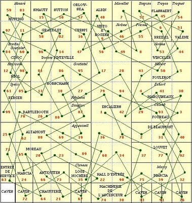


179prs_Rochester Won, Islington Nil
James Kirkup (not to be confused with James Ukip) writes in The Telegraph: “Perhaps the most telling thing about Emily Thornberry’s political demise is the defence she offered for her fatal Twitter picture of Dan Ware’s flag-draped house and a white van: She had “never seen” such a sight before, and thought it “absolutely amazing”, she said. That proclaimed ignorance, arguably, is more culpable than the sneering motives many have imputed to Ms Thornberry. An elected member of the House of Commons finds the habits of the English working class alien to the point of fascination. The Thornberry saga is, initially, a problem for her party, Labour, which is struggling to hold on to voters who drive vans, like football, drink beer and display the cross of St George without embarrassment or irony. But it also says something about our politics as a whole, about the dominance of the middle classes and their values, to the exclusion of those lower down the socio-economic order. In 1997, John Prescott suggested that “We are all middle class now”, but despite an economic shift from manual to intellectual labour, quite a lot of people in the UK can still be described as working class: around 40 per cent in all.”
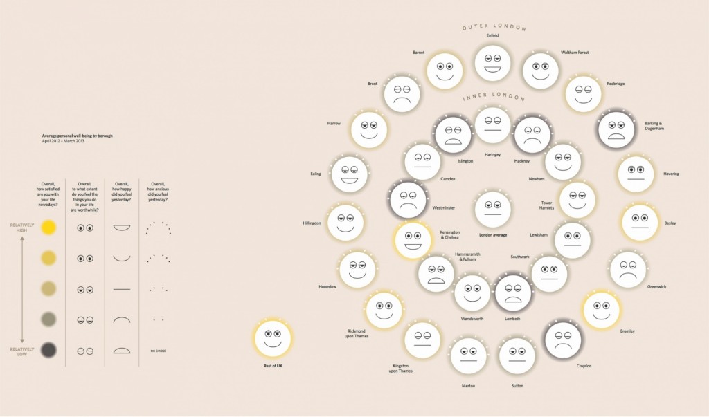
Emily Thornberry is the Labour MP for Islington South and Finsbury. Her current predicament merely reinforces data produced with The Information Capital that those living in middle class Islington, presumably white van, flag free to Thornberry (presumably not a Gooner), are the unhappiest of citizens of London. Across the pond even Capital America has said through Franklin D. Roosevelt: “Happiness is not in the mere possession of money; it lies in the joy of achievement, in the thrill of creative effort.” In the pursuit of happiness, we need to trade material for social wealth. [+] [+] [+]
This comment was written in an East London tower block.




179prs_THE GAME OF TALKING BUILDINGS
If buildings could talk… WHAT would they say? Would it tell us a story of why they exist?
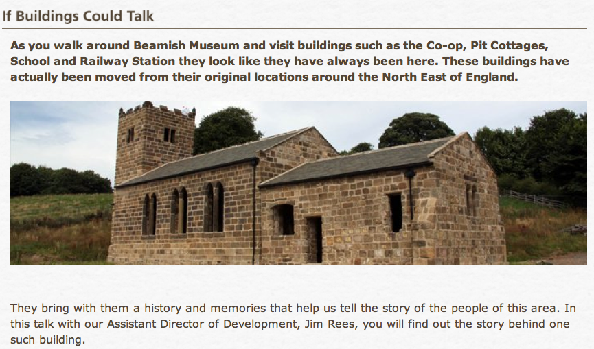 If building could talk… WHAT would they say? Would they ask you to come and work on them?

 If building could talk… WHAT would they say? Would they ask you to come and work on them?


221dog_THE FRIENDLIEST SPOTTED DOG IN THE WORLD: A GAME OF DRAWING.
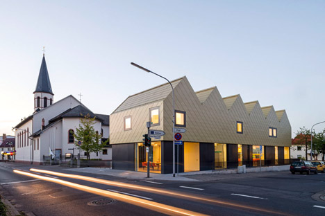
Is the morphology of a contemporary detailed gabled terrace possibly frightening to the local community due to its ‘pointedness’? Are we bizarrely hearing that that a pointed gabled roofline equates to teeth of say The Angriest Dog InThe World?  This is popular criticism, hewn through ‘design police’ panel review, gone barking mad. Nonetheless, architects need to deal with populist-morphological criticisms (for example: Zaha with her Doha stadium genitalia detaglia). In the 048per_ public planning review a few years ago I heard that our design of what appeared to be crooked house equated a crooked owner. Dezeen in its review of a community centre in Germany with its “golden zigzagging roof” on other hand has more tooth for a gabled architecture. The design democracy of panel review can sometimes lead to criticism which whilst socially inclusive is too basic. Design by democracy. However I do agree that Architecture can soften the popuist-blow of what might be, that is Passive – Aggressive architecture, with ‘softer’ means. A hand drawing representation!
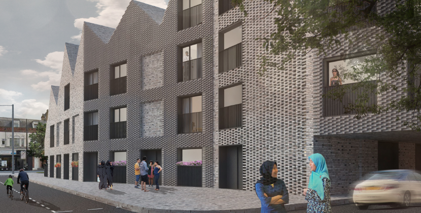
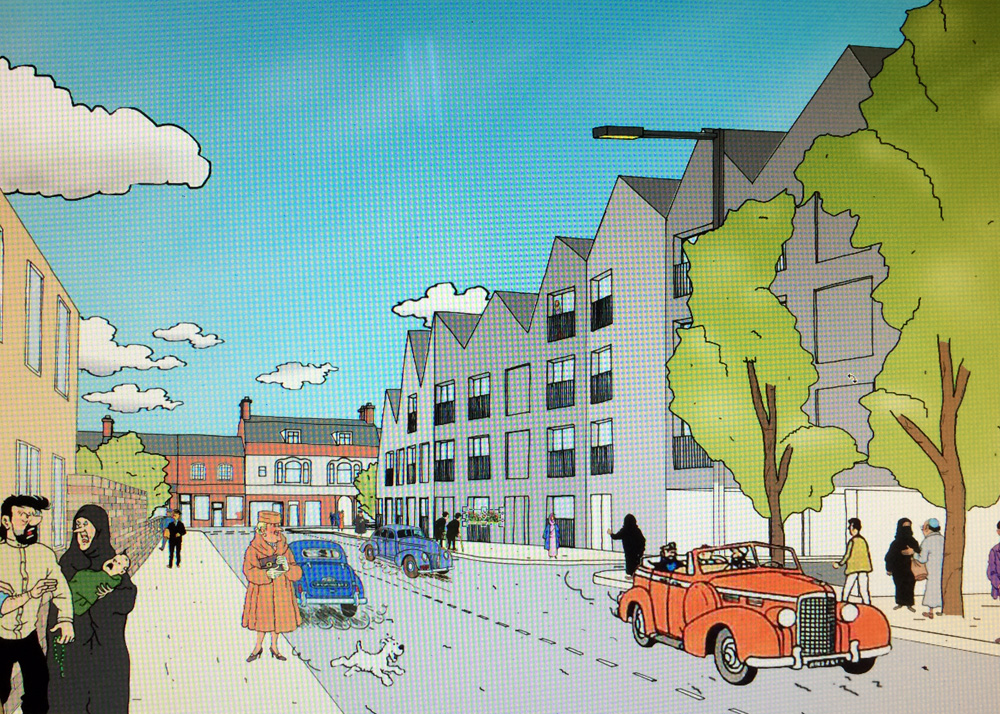
 Robin Evans talked about the emotional content of a hand drawn line over that of a CAD. Fluffy dogs, like the internet meme doge, apparently don’t bite.

 This is popular criticism, hewn through ‘design police’ panel review, gone barking mad. Nonetheless, architects need to deal with populist-morphological criticisms (for example: Zaha with her Doha stadium genitalia detaglia). In the 048per_ public planning review a few years ago I heard that our design of what appeared to be crooked house equated a crooked owner. Dezeen in its review of a community centre in Germany with its “golden zigzagging roof” on other hand has more tooth for a gabled architecture. The design democracy of panel review can sometimes lead to criticism which whilst socially inclusive is too basic. Design by democracy. However I do agree that Architecture can soften the popuist-blow of what might be, that is Passive – Aggressive architecture, with ‘softer’ means. A hand drawing representation!


 Robin Evans talked about the emotional content of a hand drawn line over that of a CAD. Fluffy dogs, like the internet meme doge, apparently don’t bite.


000off_BLIND-FOLDED CRITIQUE / DARK-ITECTURE
blablablarchitecture is talking buildings. This posits listening to architecture over looking at architecture.
‘Blindfold Critique’ is a new way of looking at architecture. Or rather not looking at architecture in that it goes beyond the visual and into the aural. An architect or critic is blindfolded, and taken to an architectural site, where they are asked to give their critique as they are led through the architecture. These critiques have been recorded and edited by Joshua David Lynch and are presented here as audio files (and best listened to through headphones).
Blindfold Critiques where done as part of the 2013 Sydney Architecture Festival and were presented as part of the Expanded Architecture at The Rocks Exhibition. 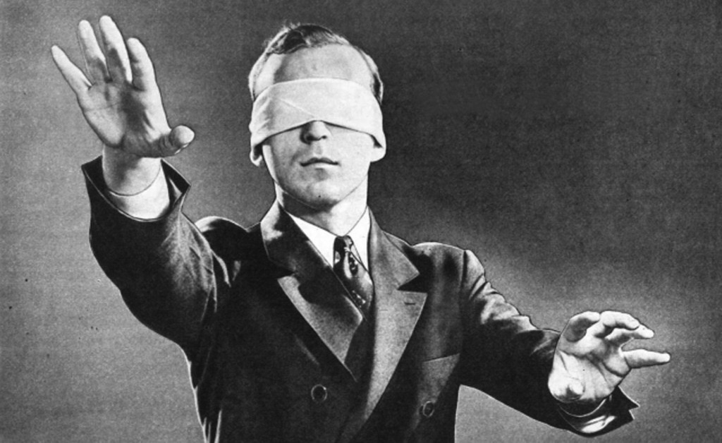 Following on from BlindFold Critiques is this essay Dark-itecture by SOPHIA BANNERT which won the AJ Writing Prize 2014. Architecture doesn’t always engage all of our senses, and tends to rely heavily on sight; appearance rules over experience. Architecture continues to be theorised and practised as an art form of the eye. As a result, it is dominated by considerations such as visual harmony, the divine proportion and the golden ratio. Throughout history, buildings have mostly been about visual seduction to be marvelled at, rather than skilful arrangements of materials and sensations, to create comfortable and inspiring places for everyday use. It’s right that they should be visually stimulating, but let’s not forget our other senses. With the right formula appealing to all of our senses, architecture holds the power to influence your feelings towards a space, your mood, and how you feel about yourself, on a subconscious level. A good architect should be aware of this. Danish architect Steen Eiler Rasmussen said the job of the architect is to ‘remain anonymously in the background, resembling the theatrical producer. He composes the music others will play.’ Composing inspirational and stimulating atmospheres is more effective when an orchestra of senses is involved. This led me to question how rich spaces can be when we take something as predominant as vision out of the equation. A visit to the French restaurant Dans le Noir? provided me with an ensemble of sensory experiences by removing my sense of sight, thus heightening my other senses. The restaurant is unique in the fact that the waiters are visually impaired. The guest is served in complete darkness which reignites one’s sensory and spatial awareness. For once, the blind can act as your eyes, guiding you through the (step-free) experience. The digital revolution makes it difficult to pay attention to the present moment. Therefore, no electronic devices are allowed in, which could serve as distractions. My initial reaction was one of disorientation and unease; deprivation of sight can be frightening. Our eyes are responsible for 80 per cent of the information our brain receives. This makes it the most vital sensory input of the human body. Take that away and the brain is forced to rely on its other senses. Sound is the second most important sense and without sight I was profoundly aware of the acoustics: melodic jazz in the background, mixed with conversational murmurings. Carpet beneath my feet, I reached my hand out and touched a wall which was divided, the top half seemed to have a material covering, and halfway down I felt what I thought must have been heavy wallpaper. The table cloth felt like linen, and I sat in a leathery chair. The room seemed intimate and private, with few other people. Surprisingly the room actually served 60 people. How interesting that when sound is muted and sight removed, one’s spatial awareness can be so wrong. During the meal, I become acutely more aware of the way I was using my voice in conversation. (How do you convey a smile in the dark?) Pitch, speed, volume and tone of voice were suddenly crucial for communication. (Nodding my head in agreement was a wasted gesture – yet I still found myself doing it.) Conversation became an art once more and I felt it was more meaningful. I felt at ease and confident. Visual limitations became liberating. Being became much simpler. I entered a space devoid of vanity; shyness conquered. In this room sensory perception was magnified and, with the removal of sight, style became meaningless. Juhani Pallasmaa once said: ‘Architecture is a slow and silent background phenomenon that frames human experience and gives it specific horizons of meaning. This silent but perpetual presence is the special monumental power of the art of architecture.’ If architects were blind, spaces would be more ergonomic and logical; design of the human experience would be crucial. The architecture here is the feeling created. The light scent of food increased my appetite and anticipation of what I was about to eat. Odours are chemicals which powerfully affect our brain function; influencing mood shifts and triggering involuntary memories and feelings. The smell of good food triggered, for me, associations with homely comfortable memories, which furthered the relaxed ambience. My entire perception of time disappeared whilst I was in the room. Can a space alter the way time is perceived? Neuroscientist David Eagleman states that when we hear enjoyable sounds and experience new sensations, the greater attention we pay leads to perception of a longer period of time. ‘When familiar information is processed, this doesn’t take much time at all. New information however, is a bit slower to process and makes time feel elongated.’ The concept of a space altering our perception of time is thought provoking. We live such busy lives; it would be wonderful to be able to create the illusion of slowing time down to enjoy the present. Without romanticising being blind, my visit to Dans le Noir? raised my awareness of the importance of our environments, and the way in which we perceive them, in a way no other place could, by allowing one’s other senses to fully engage in the environment – without the overriding reliability on sight. The genius-loci or spirit of place is easier to feel than see. Our over-connected environments are becoming sensory impoverished and lack inspirational non-visual stimuli. Modern digital culture can conflict with meaningful human communication. Can we, as architects, address this isolation by creating spaces in which people can reconnect on a more intimate level? To open a restaurant in which one dines in complete darkness was a courageous act, but in doing so they have provided the diner with a banquet of sensory stimuli. It’s an irony that if a sense is taken away, one can become more sensually aware. To quote Marcel Proust: ‘The real act of discovery consists not in finding new lands, but in seeing with new eyes.’ Guests leave with a new found multisensory awareness, to perhaps rediscover something lost.’
 Following on from BlindFold Critiques is this essay Dark-itecture by SOPHIA BANNERT which won the AJ Writing Prize 2014. Architecture doesn’t always engage all of our senses, and tends to rely heavily on sight; appearance rules over experience. Architecture continues to be theorised and practised as an art form of the eye. As a result, it is dominated by considerations such as visual harmony, the divine proportion and the golden ratio. Throughout history, buildings have mostly been about visual seduction to be marvelled at, rather than skilful arrangements of materials and sensations, to create comfortable and inspiring places for everyday use. It’s right that they should be visually stimulating, but let’s not forget our other senses. With the right formula appealing to all of our senses, architecture holds the power to influence your feelings towards a space, your mood, and how you feel about yourself, on a subconscious level. A good architect should be aware of this. Danish architect Steen Eiler Rasmussen said the job of the architect is to ‘remain anonymously in the background, resembling the theatrical producer. He composes the music others will play.’ Composing inspirational and stimulating atmospheres is more effective when an orchestra of senses is involved. This led me to question how rich spaces can be when we take something as predominant as vision out of the equation. A visit to the French restaurant Dans le Noir? provided me with an ensemble of sensory experiences by removing my sense of sight, thus heightening my other senses. The restaurant is unique in the fact that the waiters are visually impaired. The guest is served in complete darkness which reignites one’s sensory and spatial awareness. For once, the blind can act as your eyes, guiding you through the (step-free) experience. The digital revolution makes it difficult to pay attention to the present moment. Therefore, no electronic devices are allowed in, which could serve as distractions. My initial reaction was one of disorientation and unease; deprivation of sight can be frightening. Our eyes are responsible for 80 per cent of the information our brain receives. This makes it the most vital sensory input of the human body. Take that away and the brain is forced to rely on its other senses. Sound is the second most important sense and without sight I was profoundly aware of the acoustics: melodic jazz in the background, mixed with conversational murmurings. Carpet beneath my feet, I reached my hand out and touched a wall which was divided, the top half seemed to have a material covering, and halfway down I felt what I thought must have been heavy wallpaper. The table cloth felt like linen, and I sat in a leathery chair. The room seemed intimate and private, with few other people. Surprisingly the room actually served 60 people. How interesting that when sound is muted and sight removed, one’s spatial awareness can be so wrong. During the meal, I become acutely more aware of the way I was using my voice in conversation. (How do you convey a smile in the dark?) Pitch, speed, volume and tone of voice were suddenly crucial for communication. (Nodding my head in agreement was a wasted gesture – yet I still found myself doing it.) Conversation became an art once more and I felt it was more meaningful. I felt at ease and confident. Visual limitations became liberating. Being became much simpler. I entered a space devoid of vanity; shyness conquered. In this room sensory perception was magnified and, with the removal of sight, style became meaningless. Juhani Pallasmaa once said: ‘Architecture is a slow and silent background phenomenon that frames human experience and gives it specific horizons of meaning. This silent but perpetual presence is the special monumental power of the art of architecture.’ If architects were blind, spaces would be more ergonomic and logical; design of the human experience would be crucial. The architecture here is the feeling created. The light scent of food increased my appetite and anticipation of what I was about to eat. Odours are chemicals which powerfully affect our brain function; influencing mood shifts and triggering involuntary memories and feelings. The smell of good food triggered, for me, associations with homely comfortable memories, which furthered the relaxed ambience. My entire perception of time disappeared whilst I was in the room. Can a space alter the way time is perceived? Neuroscientist David Eagleman states that when we hear enjoyable sounds and experience new sensations, the greater attention we pay leads to perception of a longer period of time. ‘When familiar information is processed, this doesn’t take much time at all. New information however, is a bit slower to process and makes time feel elongated.’ The concept of a space altering our perception of time is thought provoking. We live such busy lives; it would be wonderful to be able to create the illusion of slowing time down to enjoy the present. Without romanticising being blind, my visit to Dans le Noir? raised my awareness of the importance of our environments, and the way in which we perceive them, in a way no other place could, by allowing one’s other senses to fully engage in the environment – without the overriding reliability on sight. The genius-loci or spirit of place is easier to feel than see. Our over-connected environments are becoming sensory impoverished and lack inspirational non-visual stimuli. Modern digital culture can conflict with meaningful human communication. Can we, as architects, address this isolation by creating spaces in which people can reconnect on a more intimate level? To open a restaurant in which one dines in complete darkness was a courageous act, but in doing so they have provided the diner with a banquet of sensory stimuli. It’s an irony that if a sense is taken away, one can become more sensually aware. To quote Marcel Proust: ‘The real act of discovery consists not in finding new lands, but in seeing with new eyes.’ Guests leave with a new found multisensory awareness, to perhaps rediscover something lost.’
179prs_The Games of Architecture: Photography
Photography is vital to our understanding of architecture. Whereas in the Renaissance, for example, we understood architecture through painting, today we understand architecture through the image that arrives to us via a camera lens, typically your smartphone. It is thus plausible that architecture is now only understood through the immediacy of the photographic image and that publication, not building, is the legitimate contemporary expression of architecture. Architecture is being wham, bam, instagrammed!
Dave Cowlard, who shot 012hil_Rooftop Nursery, set some of his 2nd year BFA students the task of reading Walter Benjamin’s essay ‘The Work of Art in the Age of Mechanical Reproduction’. David’s short film was made to help the student’s contextualise Benjamin’s life, his work and friendships and what it meant to be a cultural producer in Germany in the 1930s.
TBC

238myk_MYKONOS POOL
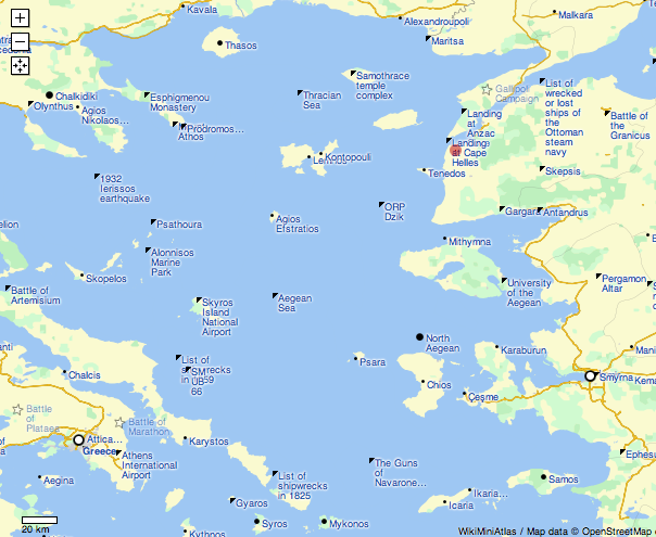
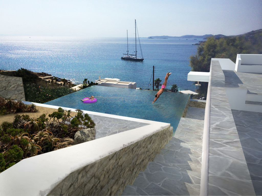
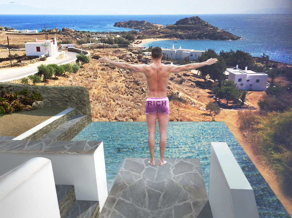
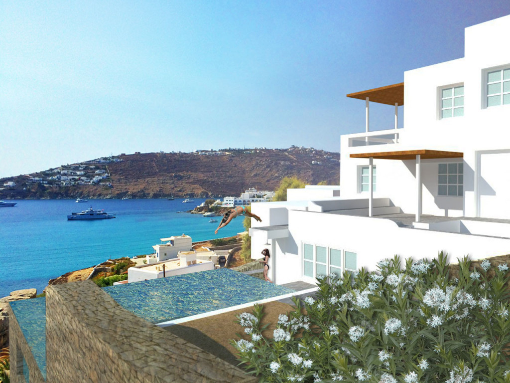
The Agean is an idyllic pool which embraces Thessalonoki to the East, Gallipoli to the North, Smyrna to the West and Mykonos to the South. It thus embraces both Greek and Turkish cultures and was the world’s original archipelago, or sea-based island cultures rather than land masses. The ebb and flow of tides erase difference. In Mykonos this could result in a pool that services an emergent type of family. One that is free from societal strictures of: nationalism, religion, sexuality and age but drawn together by a love of sun and water. SPF15 and H20, good-to-go. 